Improving the Teach For America Applicant Experience
Teach For America (TFA) recruits, trains, and places thousands of new teachers in high-need school districts across the U.S. annually. Blue State was brought in to redesign TFA’s digital ecosystem, focusing on a more personalized, cohesive, and seamless online experience for applicants.
Challenges
Corps member satisfaction was low
Application numbers had dropped
Managing content across TFA’s online properties was cumbersome
Project Goals
Create a cohesive and professional online experience for all visitors to TFA’s websites
Provide clear expectations and support for applicants during the application journey
Envision industry-leading digital experiences for corps members and alums
My Roles
First ~six months: UX Designer/Researcher
Following year+: Lead UX Strategist/Designer
Results
Second-highest applicant pool in TFA history
Improved applicant conversion rates on all measures
A more streamlined content management experience
Vision established for future platform innovations
Process
Structuring Navigation for Priority Audiences
Our research began with reviewing all local chapter sites, online forms, and survey feedback from past and current corps members. One consistent theme emerged: applicants and corps members felt under-informed about the program and unprepared for the challenges they would face.
The application process, which attracts up to 56,000 applicants for 3,500 placements each year, had multiple friction points and dropout moments. Our first step was to restructure the navigation around the applicant’s journey — emphasizing TFA’s mission, setting transparent expectations, and providing support through each application step. Secondary audiences, such as donors, were placed in a separate navigation tier to maintain focus on the corps member experience.
High-level TFA journey and site audiences — created by Andrea Powell
Header navigation — designed by Andy Babb
Creating a Flexible Content & Design System
TFA’s old site was difficult to maintain, so we worked closely with their team to develop a modular content and design system. Using Pattern Lab and atomic design principles, we created a system that empowered content creators with more flexibility, enabling faster updates and a stronger storytelling focus. The result was a dynamic, visual presentation of TFA’s mission with content that was easier to skim and navigate, improving the user experience for all site visitors.
Samples from TFA's Pattern Lab style guide and component library — built by Blue State's front-end development team
Unifying TFA’s Online Presence
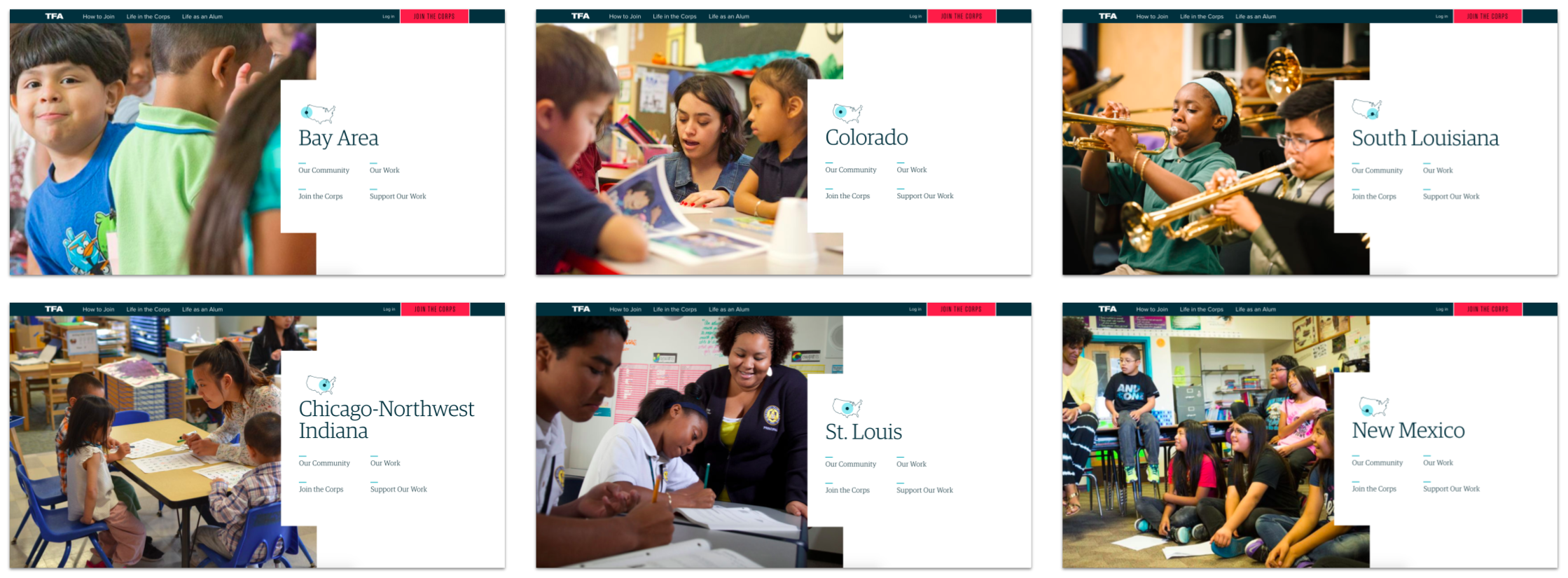
TFA’s decentralized online presence, with over 50 regional microsites, had led to brand inconsistency and confusion for applicants. We consolidated these microsites into a unified structure, creating consistent section templates that made it easier for users to compare regions while maintaining the unique identity of each chapter. This balance ensured clarity without losing the individual character of each region.
Supporting Applicants with a More Intuitive Process
Old applicant center
The application process was long, complex, and involved several stages where users could drop out. By mapping out the flow and simplifying steps where possible, we integrated a progress dashboard that visualized the application journey and helped users track their progress, jump to sections, and meet deadlines.
New step-by-step application progress tracking — wireframed by Andrea Powell
I worked with the TFA team to document the intricate relationships between application stages and state certification requirements. Although the complexity couldn’t be entirely eliminated, we significantly improved clarity by simplifying language and restructuring the flow, resulting in a smoother user experience.
New applicant dashboard — designed by Ana Jovane
Reflecting User Status Across the Site
By integrating the application platform into the main website, we ensured the site could recognize applicants’ logged-in states and provide personalized prompts and reminders. We added deadline trackers and progress indicators to nudge applicants through key moments, helping them stay on top of the long and detailed process.
Content personalization variations — wireframes by Andrea Powell
Variable content in context — designs by Andy Babb
Placement Comparison Tool
One of the most challenging steps in the application process is ranking placement preferences. TFA previously provided a confusing spreadsheet with data points such as salary, rent, and transportation options for each region.
Remote user testing of Compare Regions feature concepts — planned and facilitated by Andrea Powell
We transformed this into an interactive comparison tool that allowed users to compare regions visually using maps and list views. We iterated on the design through feedback sessions with corps alumni, refining the interface until it was intuitive and digestible. This tool was also incorporated into the “Where We Work” landing page to provide visitors with high-level information on each region.
Final Compare Regions feature (map and table views) — structure & interaction modeling by Andrea Powell, designed by Andy Babb
Concepts for Future Platform Variations
Following the successful site launch, I focused on envisioning how the platform could evolve to support corps members throughout their journey — from acceptance through training and teaching to becoming alumni. We mapped out potential features for onboarding, training preparation, and alumni engagement, ensuring the platform could scale with TFA’s evolving needs.
Post-training platform user flows — created by Andrea Powell
Concepts for future platform features and dashboard states — designed by Ana Jovane in collaboration with Andrea Powell
Outcome
The refreshed website and application platform drove a significant increase in applicants — 56,000 in the first application cycle after launch, marking the second-highest applicant pool in TFA’s history.
Conversion rates improved across the board, from initial registration to completed applications.
TFA’s internal teams reported a more streamlined content management experience.
Groundwork established for future platform innovations that will continue to serve and support corps members throughout their journey.
Final site — designed by Andy Babb and Ana Jovane


